From 2020 to 2026, I was part of the Creative Team at Impossible Foods, the brand that created “the burger that bleeds.”
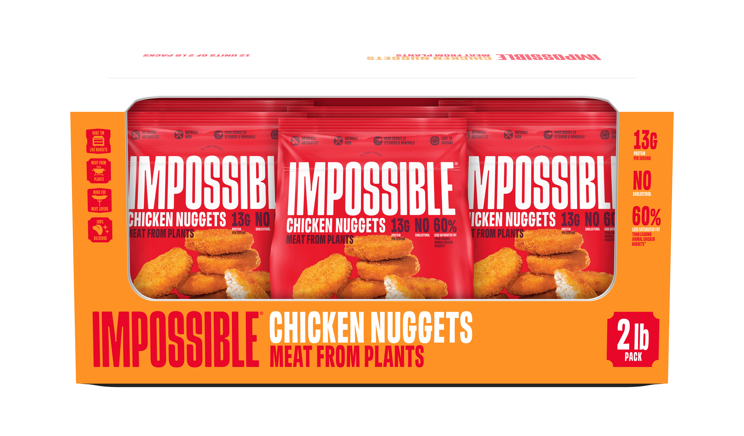
In 2025 and 2026, I led the design portion to revise the packaging guidelines for the North American retail portfolio, highlighting protein and fiber claims, new photography positioning, and content layout. I partnered closely with Brand Management, Marketing, New Product Development, Project Management, Regulatory, Legal, and Leadership teams throughout the process.
⌵
-
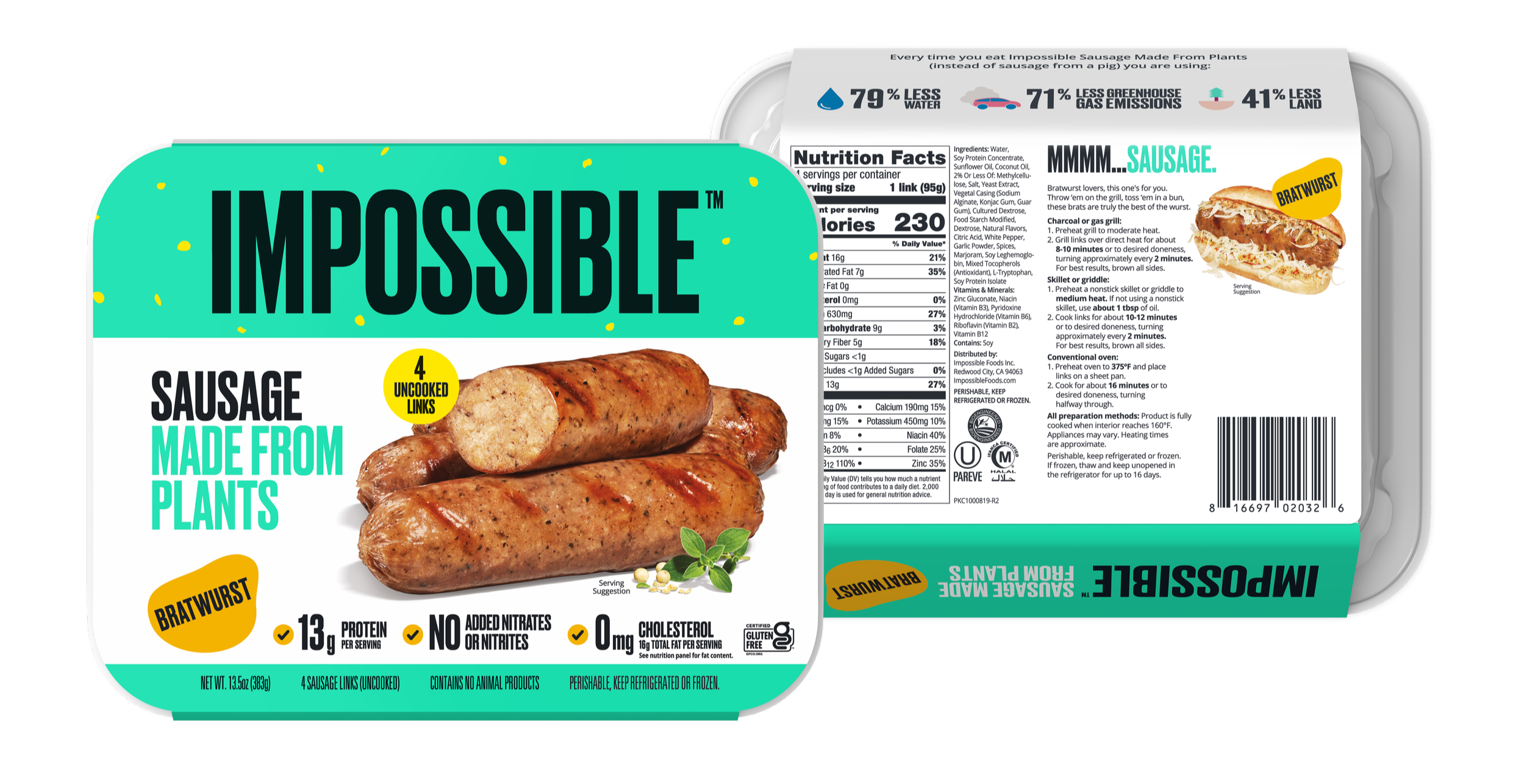
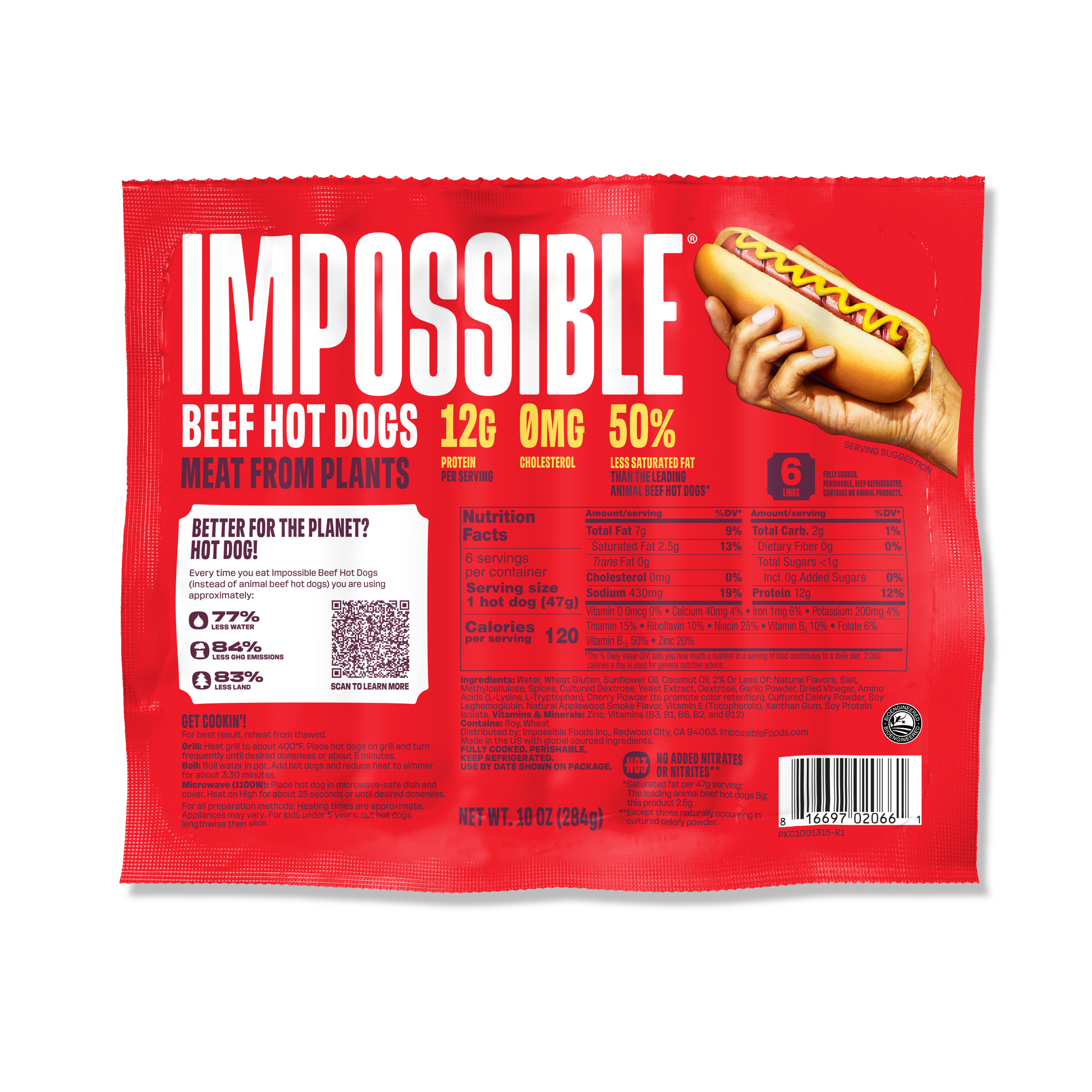
Sausage Links (Bratwurst, Spicy, and Italian) were the first to undergo the design transition.
In the new design guidelines, the protein + fiber violator sits right-aligned with the logo, but these Sausage Links are an exception, in order to give more space for the photography to stand out.Design Direction + Photography Art Direction
-
On packaging, the plant-based protein mark locks up left-aligned to the product name, vertically distanced from the product name in the same proportion as the product name from the logo itself.
I translated the design to a bilingual version for Canadian packaging.
-
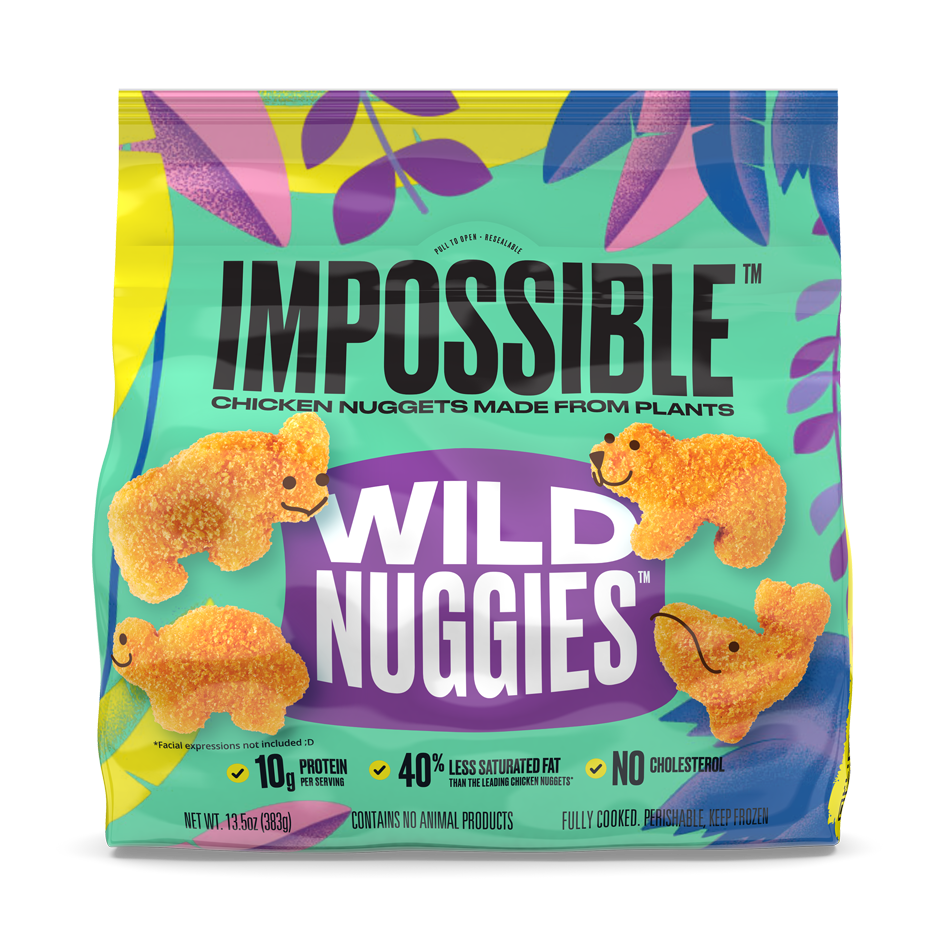
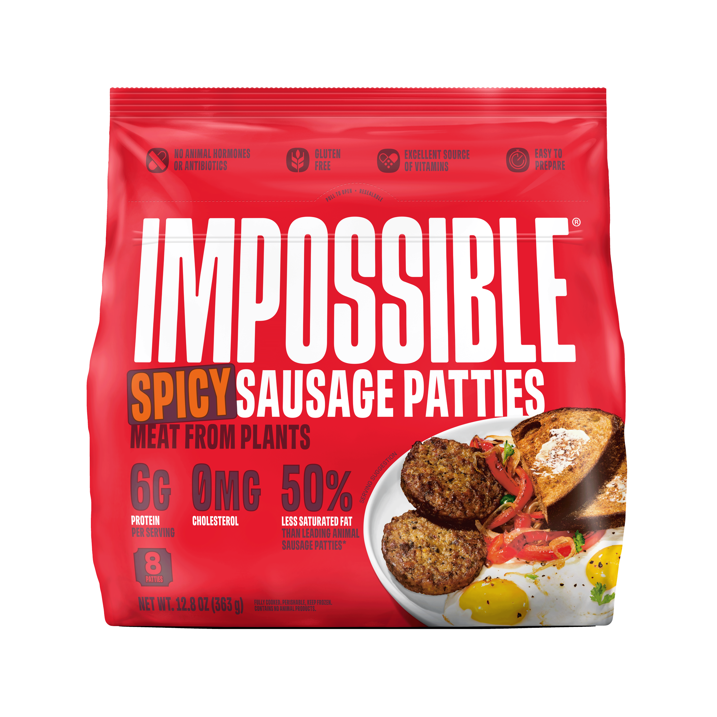
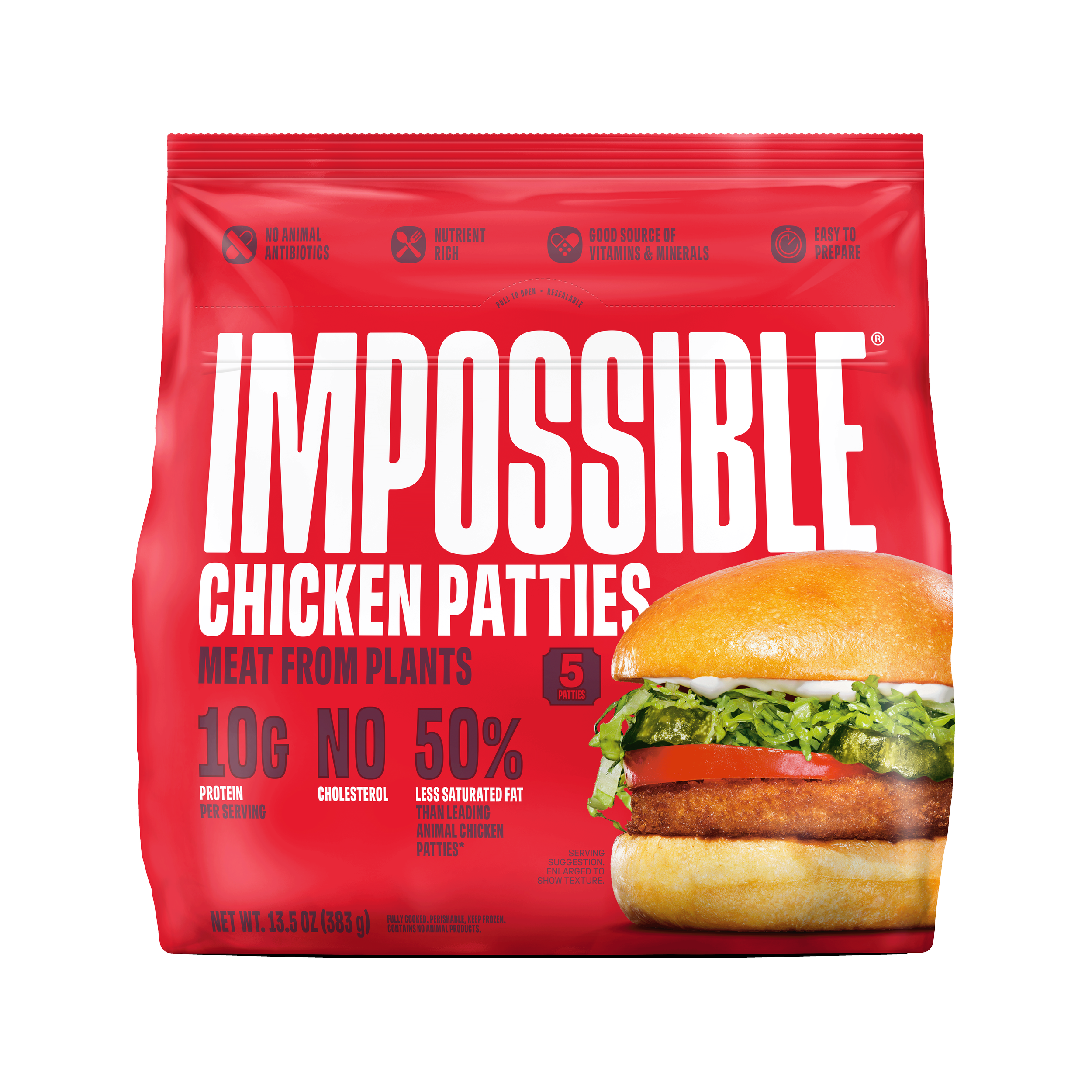
The previous pillow pouches transition to a stand-up pouch, with an envelope seal and a tear away tab at the top.
Pouch photography is centered, or bleeding off the right edge. The protein badge sits firmly aligned to the right side of the logo, but can move vertically as needed.
Design Direction, Photography Art Direction, Mechanical Design.
-
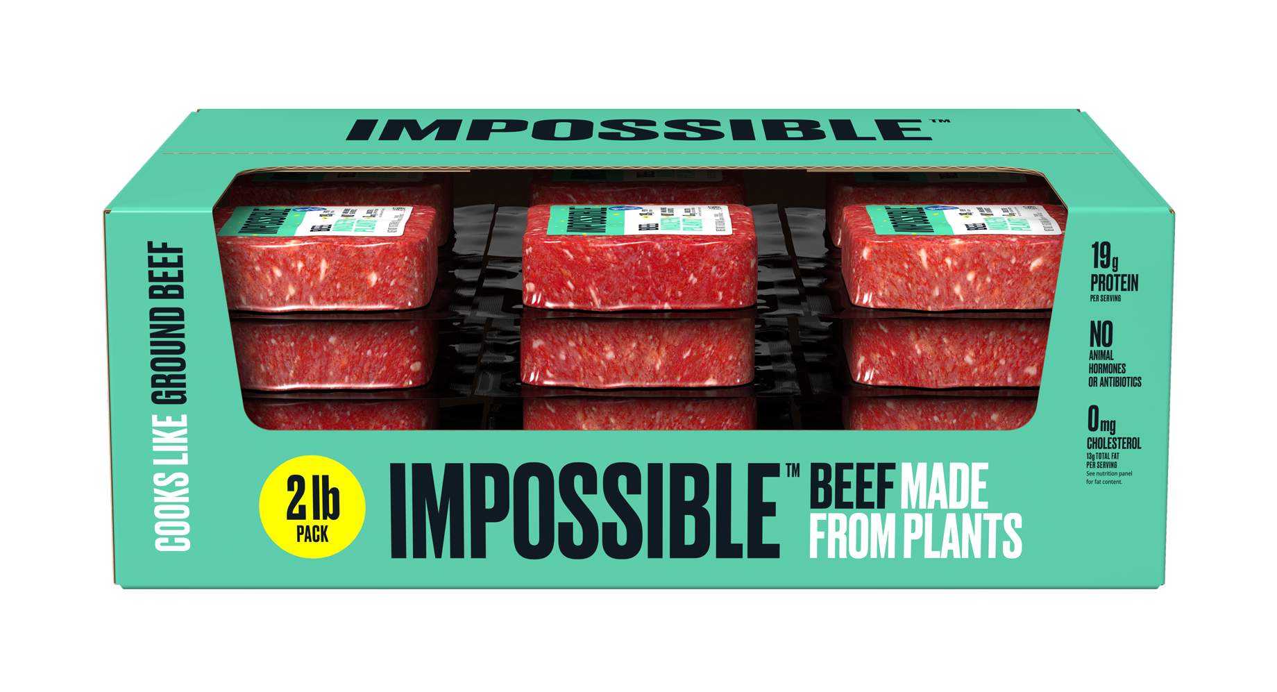
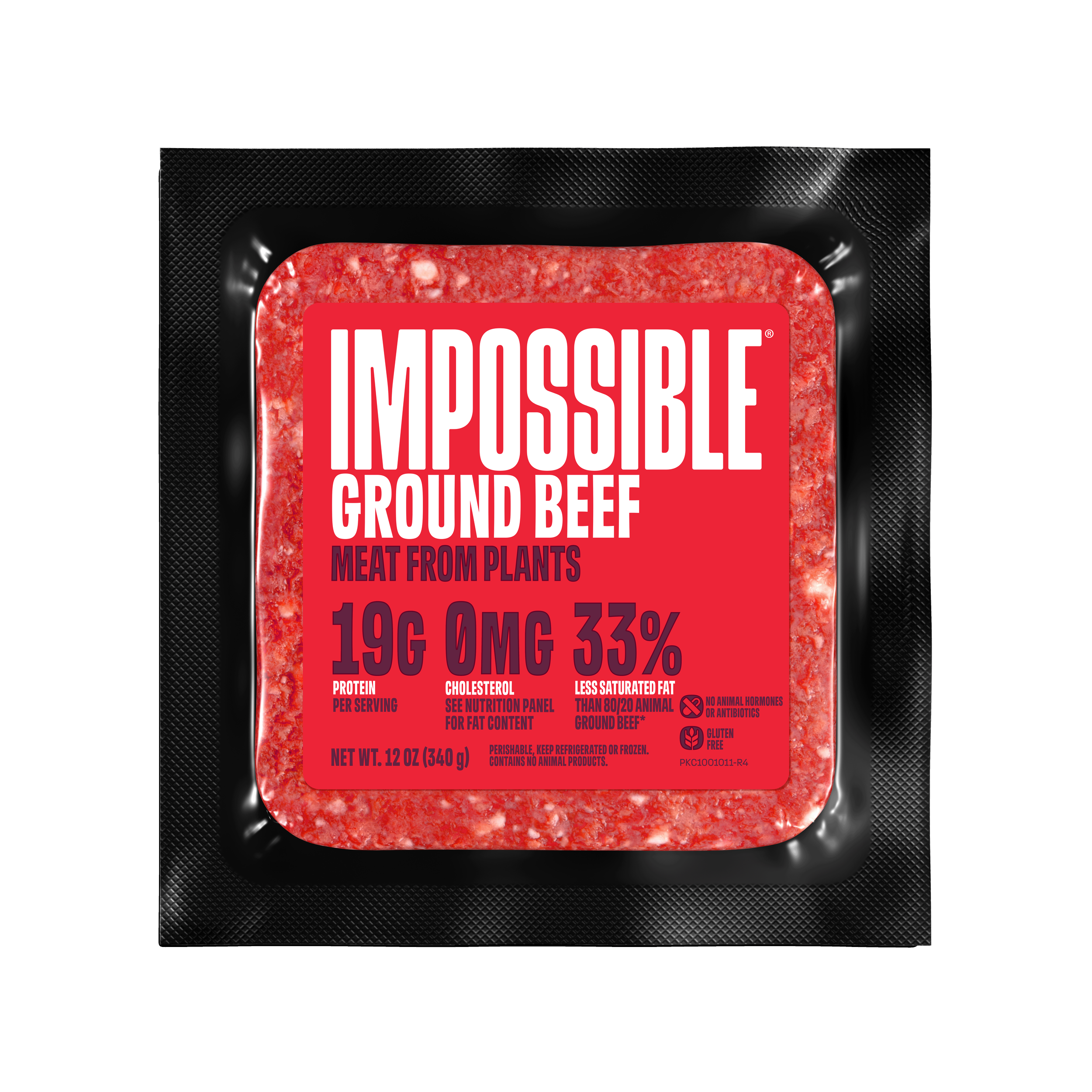
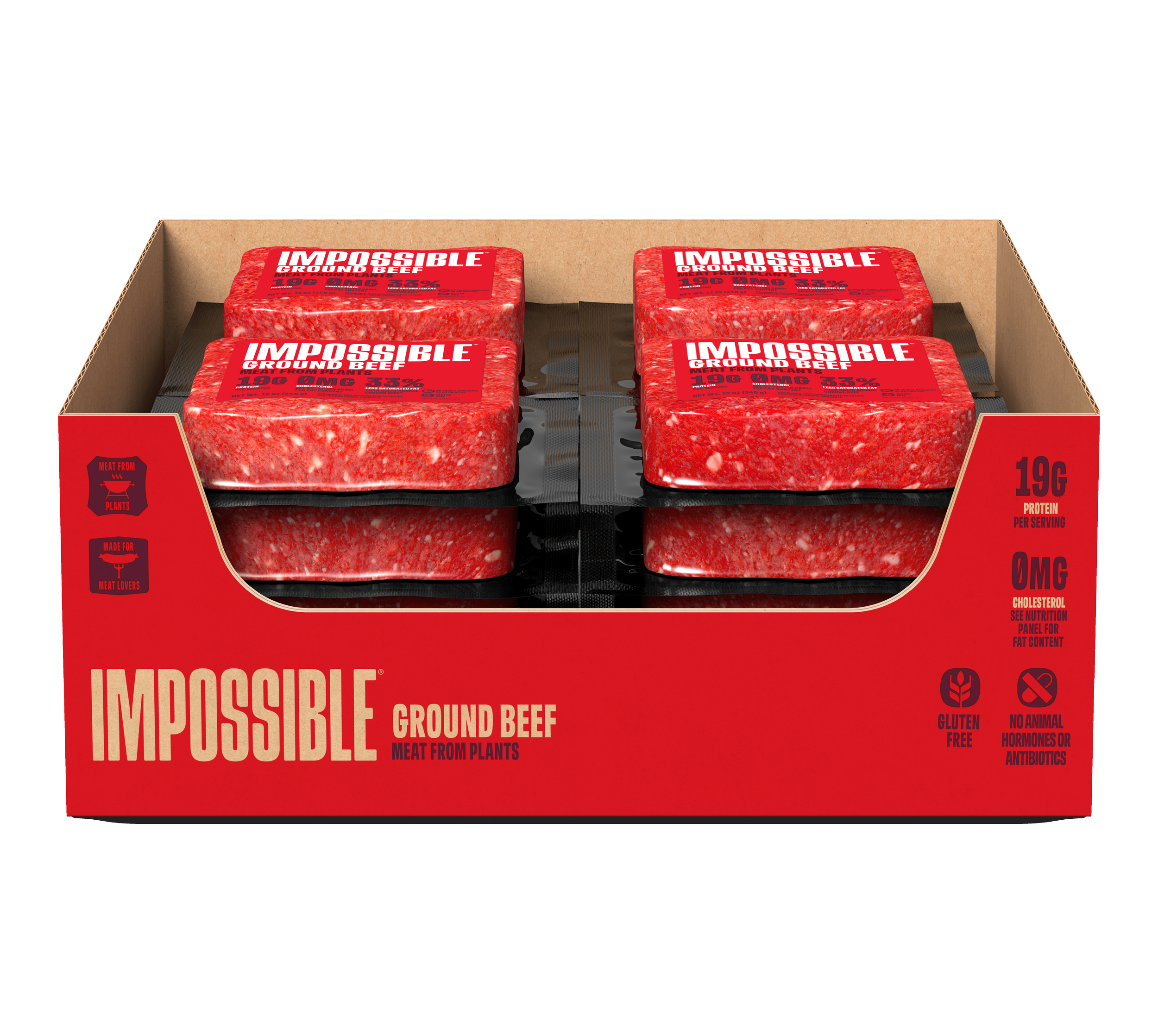
Redesign of the 12 oz Impossible Beef Meat From Plants, Impossible Foods' flagship retail product. In line with Cased Sausage updates, the three left-aligned claims from the previous 2024 design were replaced with a violator highlighting protein and fiber.
-
The protein + fiber violator generally sits aligned to the right of the “E” in the Impossible Logo, with a few exceptions if design constraints are present.
The stroke width adjusts proportionally if any change in scale is present.
It may be localized to fulfill different regions’ regulatory requirements, for example here, in Canada, and Australia-New Zealand Packaging.
From 2023 to 2024 as part of a small but mighty team, I executed Impossible Foods’ brand refresh, implementing new brand guidelines established by Jones Knowles Ritchie. We converted the entire brand asset library from legacy “green” to new “red” branding. This included all brand assets, as well as over 200 pieces of retail and food service packaging. From there, we utilized the new guidelines to design and produce new product packaging.
⌵
-
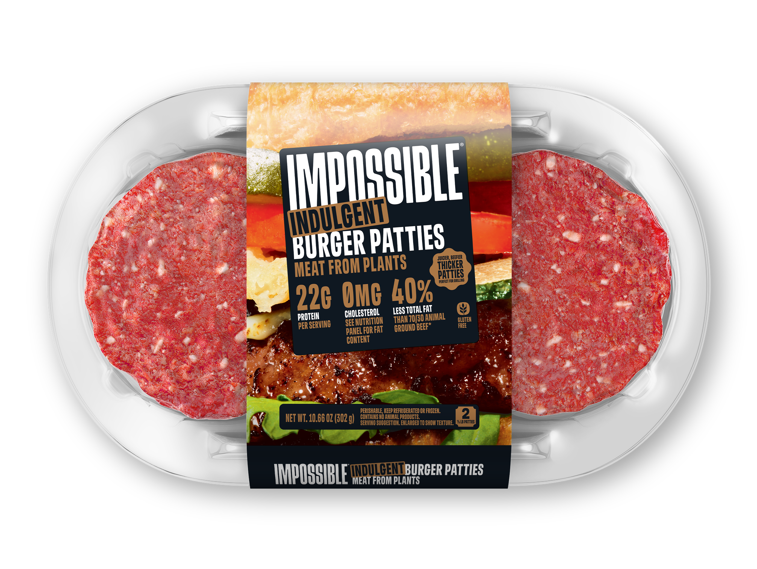
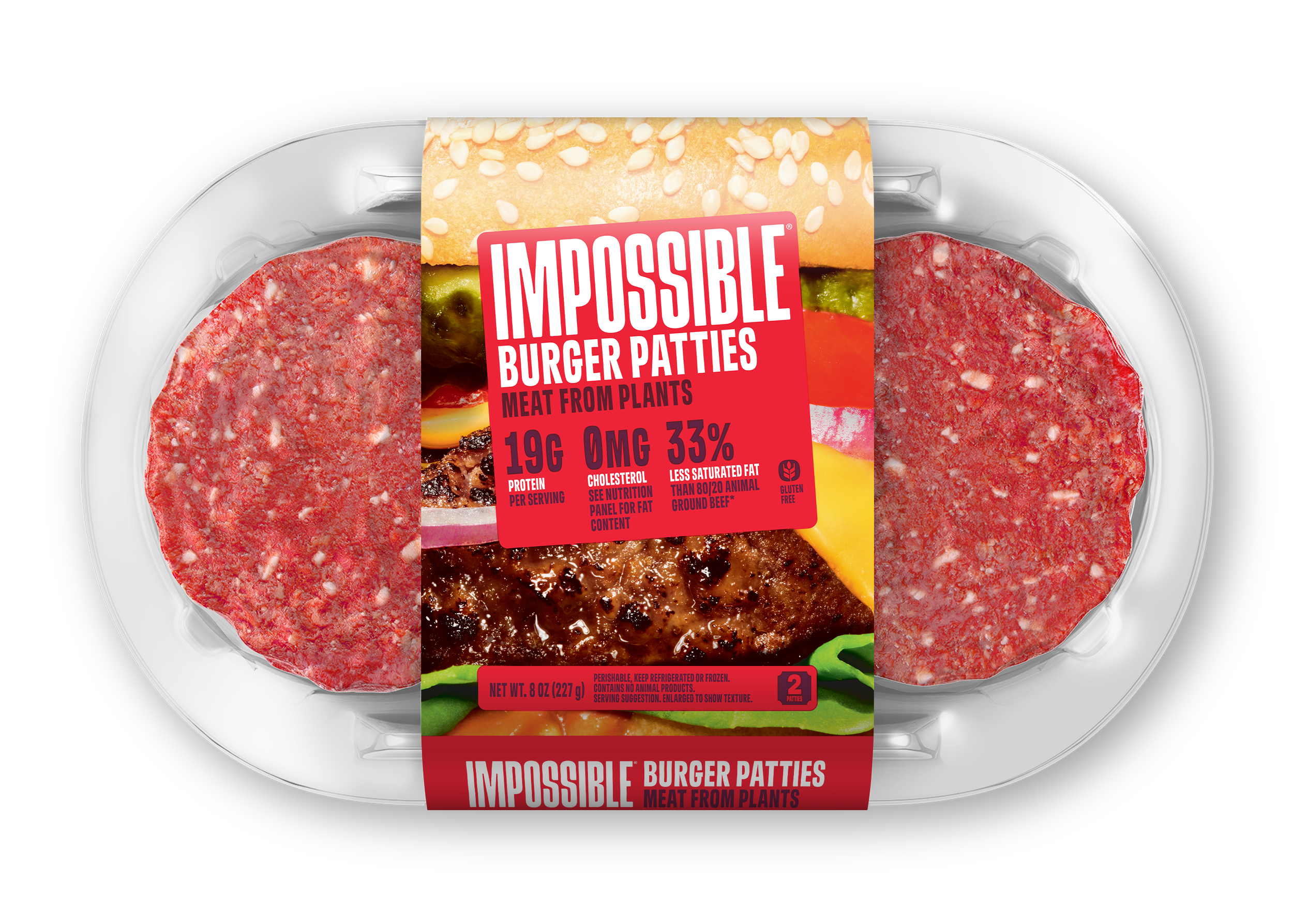
Advertisement at Costco Business Centers for redesigned plant-based Burger Patty packaging.
The “New Look” bug appears in the advertisement itself, as it was not included on the packaging.
-
PR Key Image Design announcing Impossible Foods’ 2024 New Products.
Original packaging design for Lion King Chicken Nuggets Meat From Plants, Impossible Breakfast Sandwich Sausage from Plants, and Impossible Corn Dogs Meat From Plants.
Mechanical design, press check and color management for Meal Makers (Taco and Italian-Style Beef flavors)



Between 2020-2023 I supported all types of asset design and production in Impossible Foods’ legacy “green” branding, including packaging, OOH and social graphics.
⌵
-
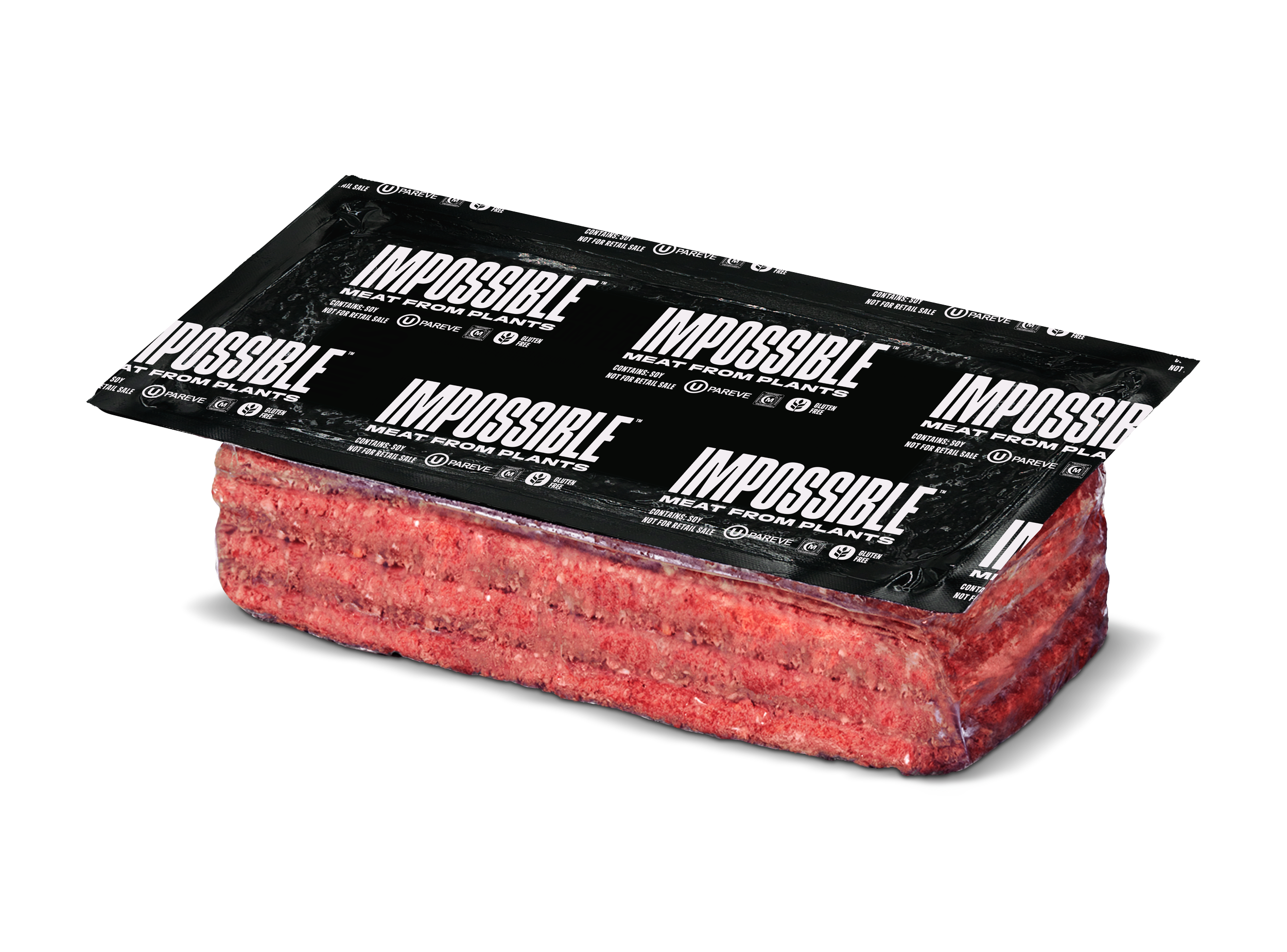
OOH Billboard Mechanical Production Marketing the new release of the “16 oz Beef Brick,” available in the Costco fresh case. Billboards were on display in the Southern California region.
-
Design + Production of social post announcing Impossible Food + Buitoni ravioli at Publix.
-
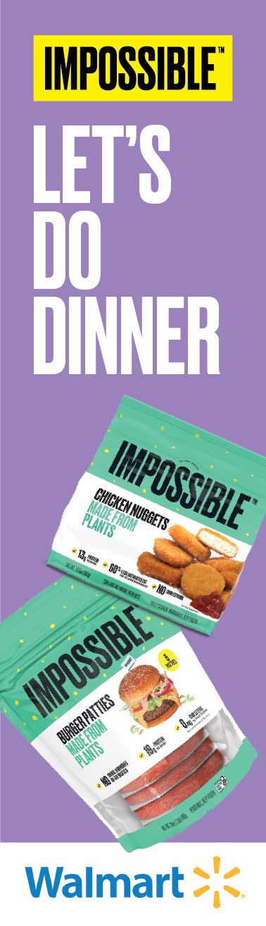
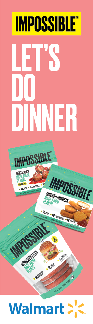
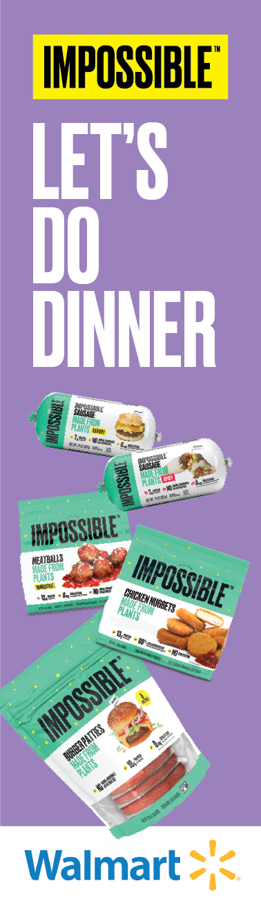
Design and Production of Shelf Talkers in Walmart Retail Stores’ Frozen sections.
-
Partnered with Copy team to concept, design and produce social post advertising Burger King’s Impossible Whopper.