From 2020-2026 I worked on the Creative Team at Impossible Foods, the brand that created “the burger that bleeds.”
When I started, we had only 2 SKUs in the retail portfolio in 3 regions. By the time my tenure ended, we had scaled to over 30 SKUs across 7 global regions.
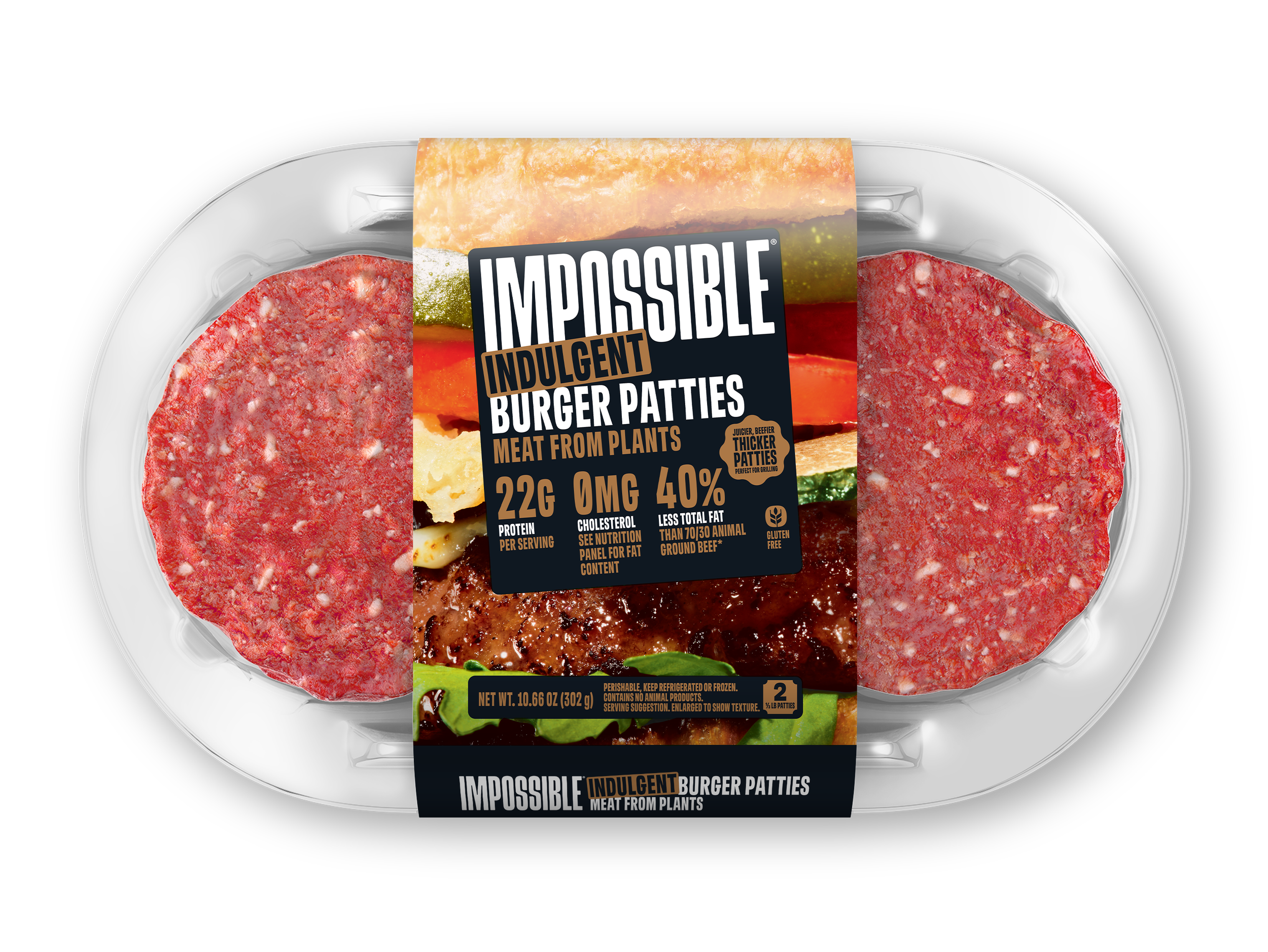
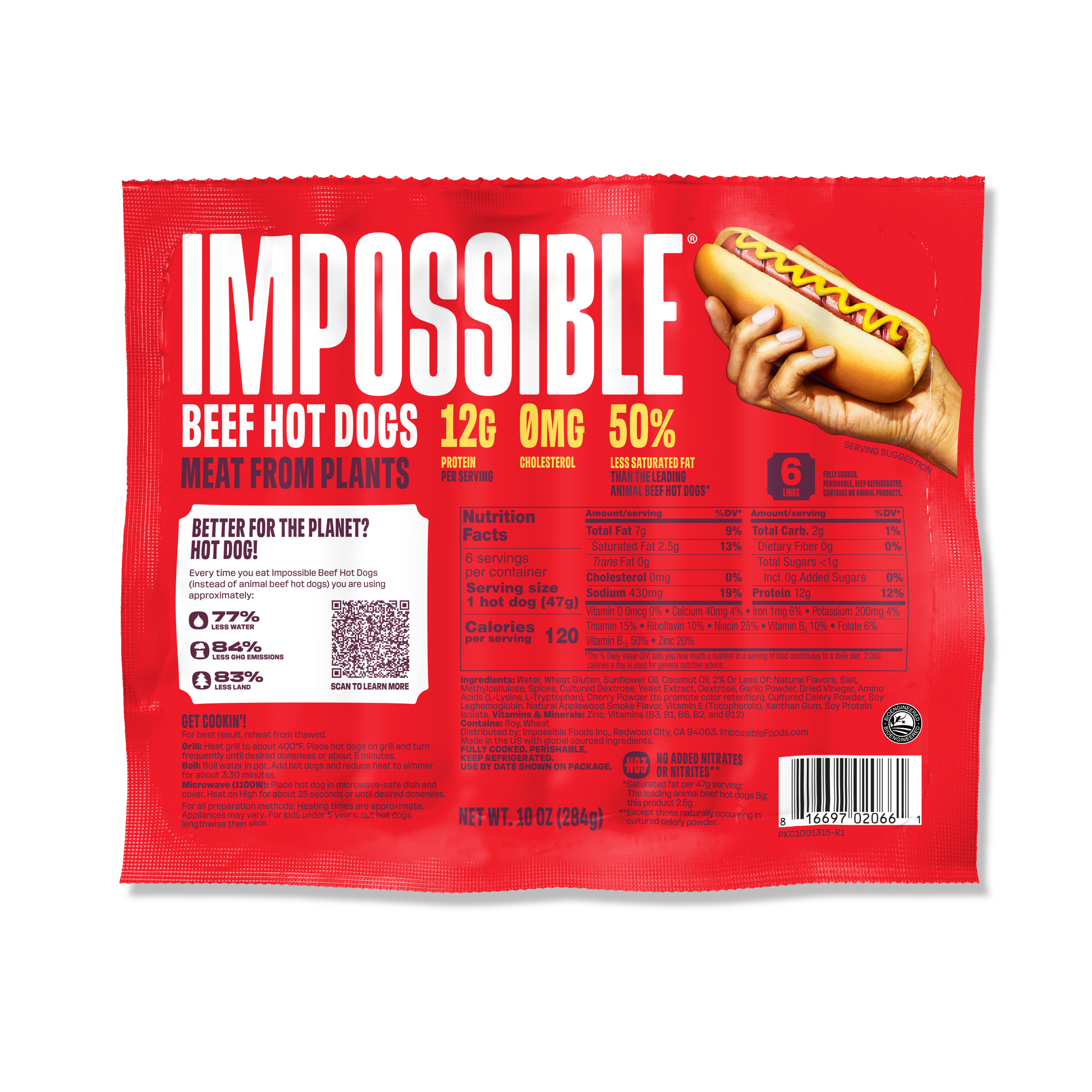
In 2025, I led a full revamp of packaging guidelines for the North America retail portfolio, including chicken, beef, corn dogs, and more.
↓
-
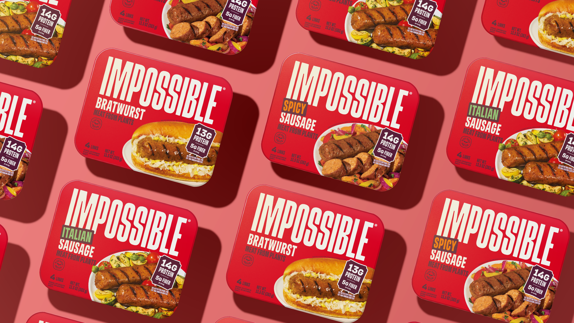
All Impossible Products underwent a rolling update in the packaging, and the Sausage Links’ update was the first to show up on shelves.
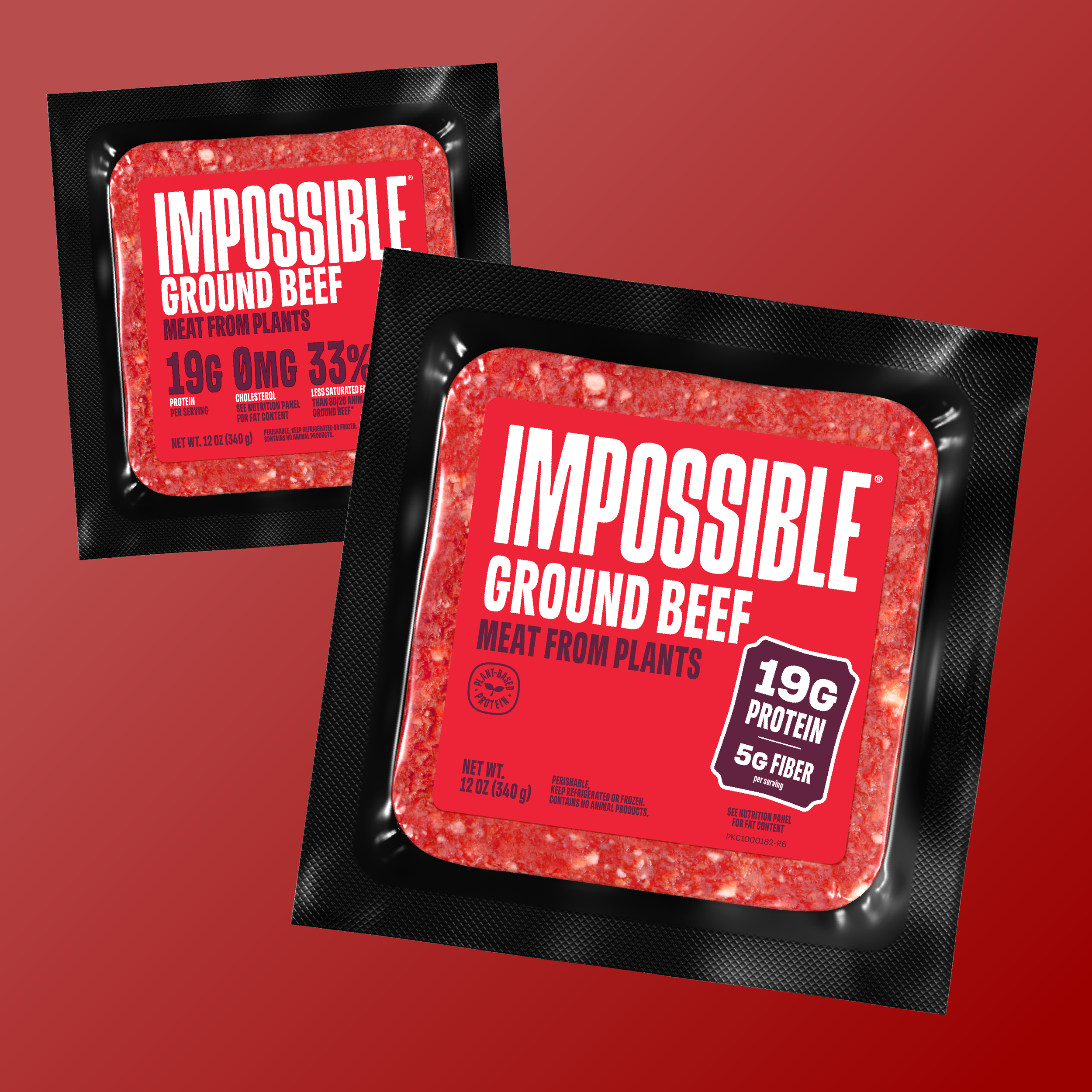
The previous packaging guidelines featured claims directly beneath and left-aligned with the product name. New guidelines have protein and fiber fetured prominently and overlapping with photography, allowing photos to take up more space while highlighting product benefits. Additional product benefits also move to the side & back of pack.
-
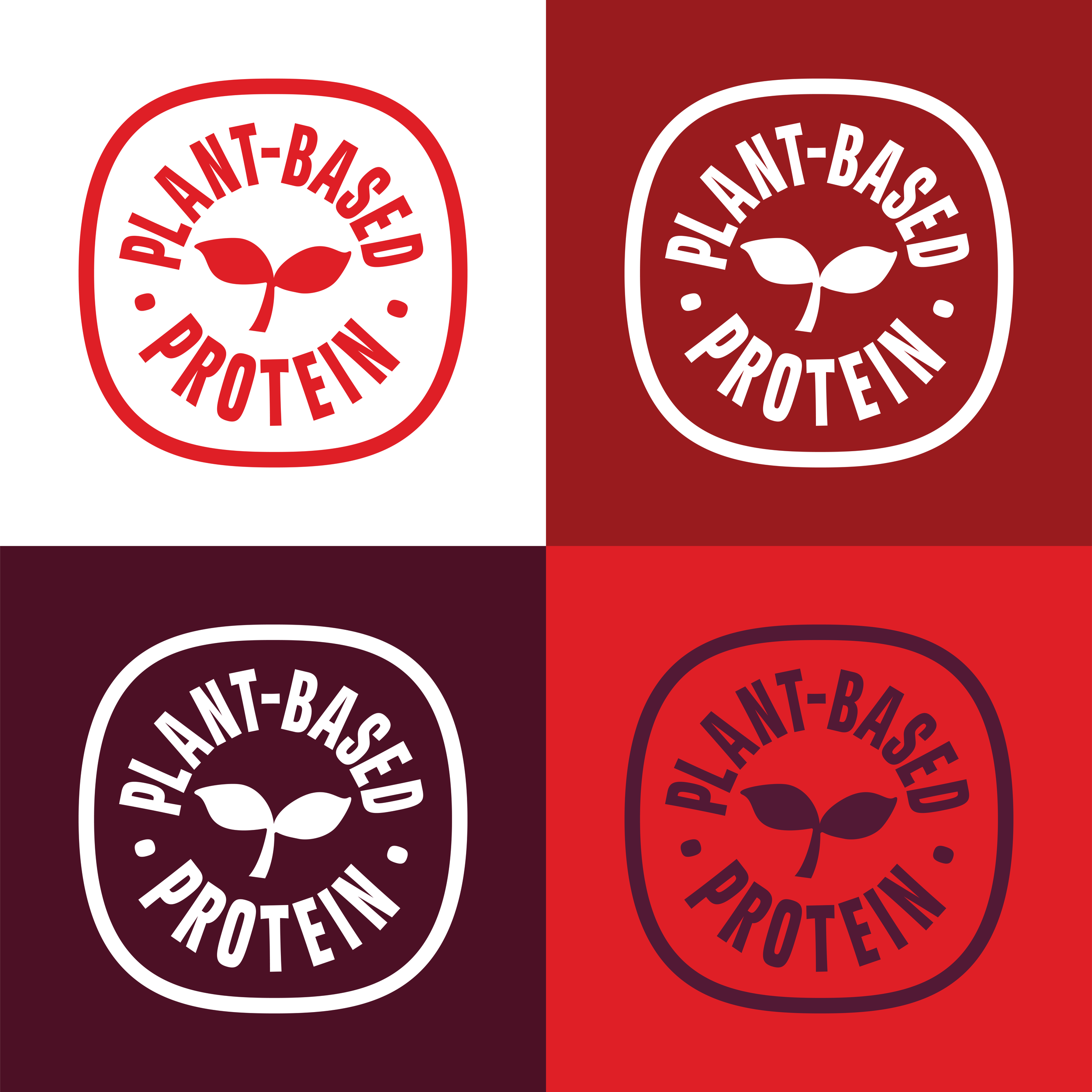
Plant-based protein bug is designated lockup left-aligned to the product name, the same space away from the product name as the logo, always overprinting.
Translated into French, the icon is used on Canadian packaging the same way.
-
The Packaging Optimization Project's first product to undergo an update was cased sausage. All products underwent a rolling update in the packaging, and cased Sausages were the first update to show up on shelves.
The previous version of this design featured the cleats directly beneath the proud ct name, and the photography roughly taking up 1/2 of the horizontal space. The new guidelines show the protein and fiber claim on the right side of the packaging, roughly in line with the product name, and overlapping with the photography. This allowed the protein and fiber claim to take be visible, without taking space away from the photography.
We also wanted to standardize the scale of the product between the different flavors of this product. That scale standardization is something that we also carried out as a new packaging brand standard across the rest of the retail portfolio.
Pouches Redesign - Photo Art Direction
-
Plant-based protein bug is designated lockup left-aligned to the product name, the same space away from the product name as the logo, always overprinting.
Translated into French, the icon is used on Canadian packaging the same way.
Protein + Fiber Violator
-
Plant-based protein bug is designated lockup left-aligned to the product name, the same space away from the product name as the logo, always overprinting.
Translated into French, the icon is used on Canadian packaging the same way.
In 2024, we partnered with brand agency Jones Knowles Ritchie to convert the entire brand asset library from legacy green to new red branding across 200+ retail and food service packaging pieces over a 1-year rollout.
↓
-
All Impossible Products underwent a rolling update in the packaging, and the Sausage Links’ update was the first to show up on shelves.
The previous packaging guidelines featured claims directly beneath and left-aligned with the product name. New guidelines have protein and fiber fetured prominently and overlapping with photography, allowing photos to take up more space while highlighting product benefits. Additional product benefits also move to the side & back of pack.
-
All Impossible Products underwent a rolling update in the packaging, and the Sausage Links’ update was the first to show up on shelves.
The previous packaging guidelines featured claims directly beneath and left-aligned with the product name. New guidelines have protein and fiber fetured prominently and overlapping with photography, allowing photos to take up more space while highlighting product benefits. Additional product benefits also move to the side & back of pack.

Impossible Lite Ground Beef - AHA certified

Costco 10ct Burger Patties